PIGEON PARADOX
︎︎︎Extensive Research
︎︎︎Publication Design
︎︎︎Generative Typography
Pigeon Paradox offers a concise yet profound journey into the misunderstood life of pigeons, transforming their image from city pests to creatures of intelligence and significance. It invites readers to rethink their views on these ubiquitous birds, highlighting their impact on urban ecosystems and cultural landscapes. Through compelling chapters, it uncovers the intricate bond between humans and pigeons, advocating for a renewed appreciation of their presence in our lives.
︎︎︎Format 8x11”, 320p
The book cover mimics the iridescent colors of urban pigeons, featuring shiny green, purple, and silver. The fabric reflects light similarly to pigeon feathers. The central graphic on the front cover represents anti-pigeon spikes, commonly installed on rooftops to deter pigeons. The back cover contrasts the front with a pattern of scattered dots symbolizing a flock of pigeons or pigeon feed, highlighting the visual difference between deterrence and attraction.


︎︎︎Prologue
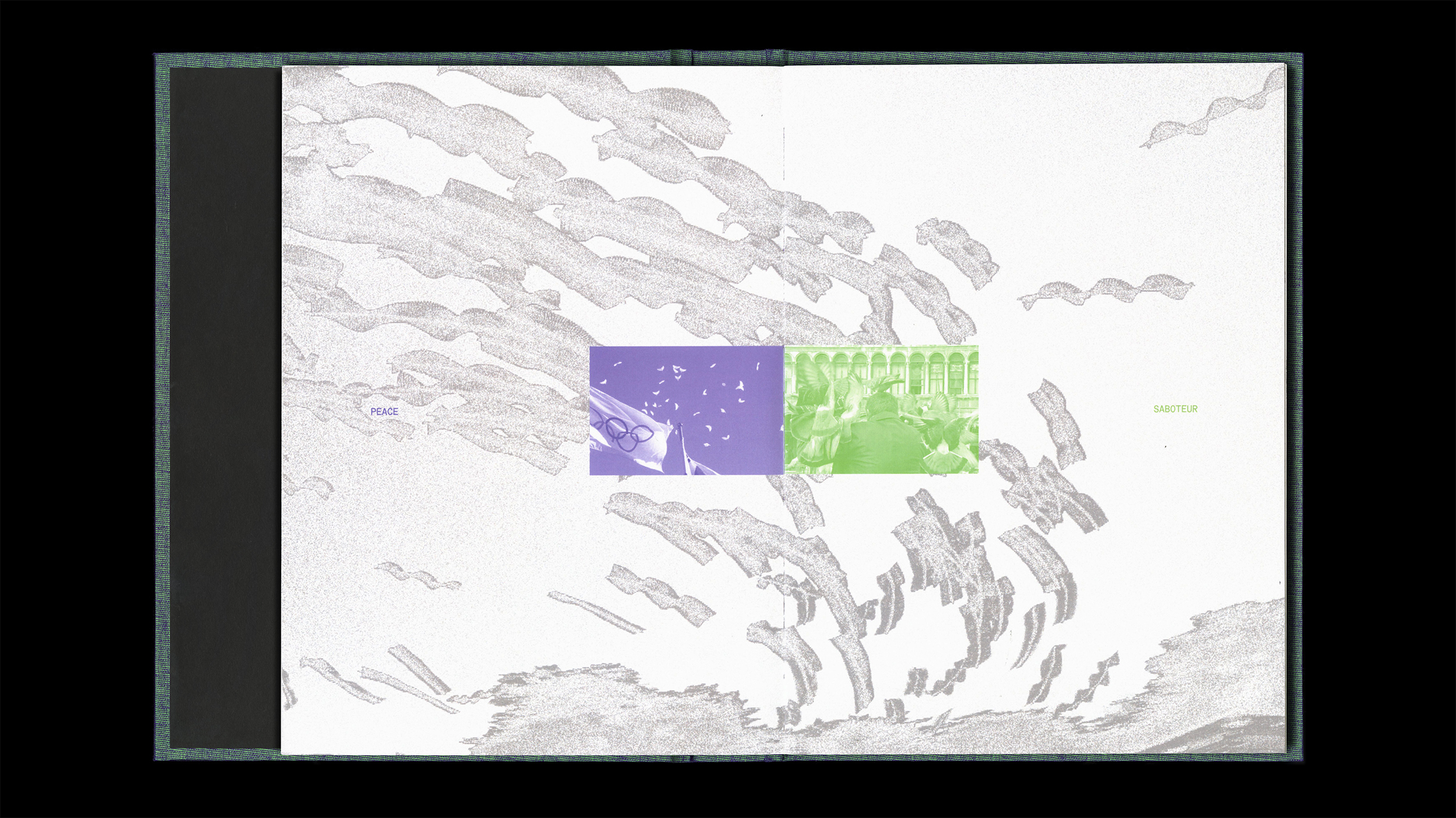
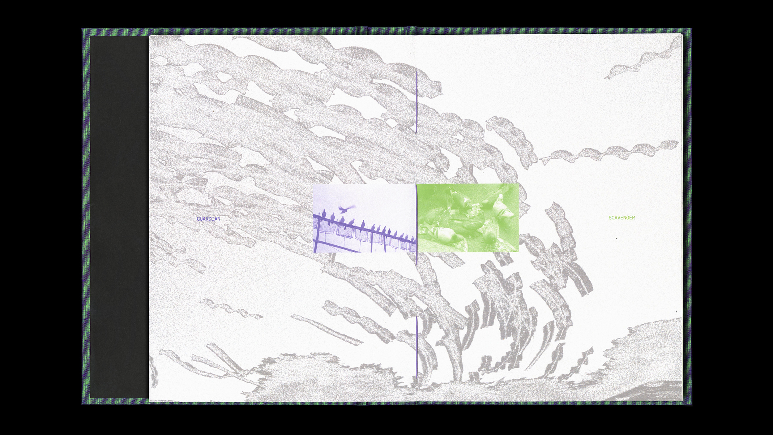
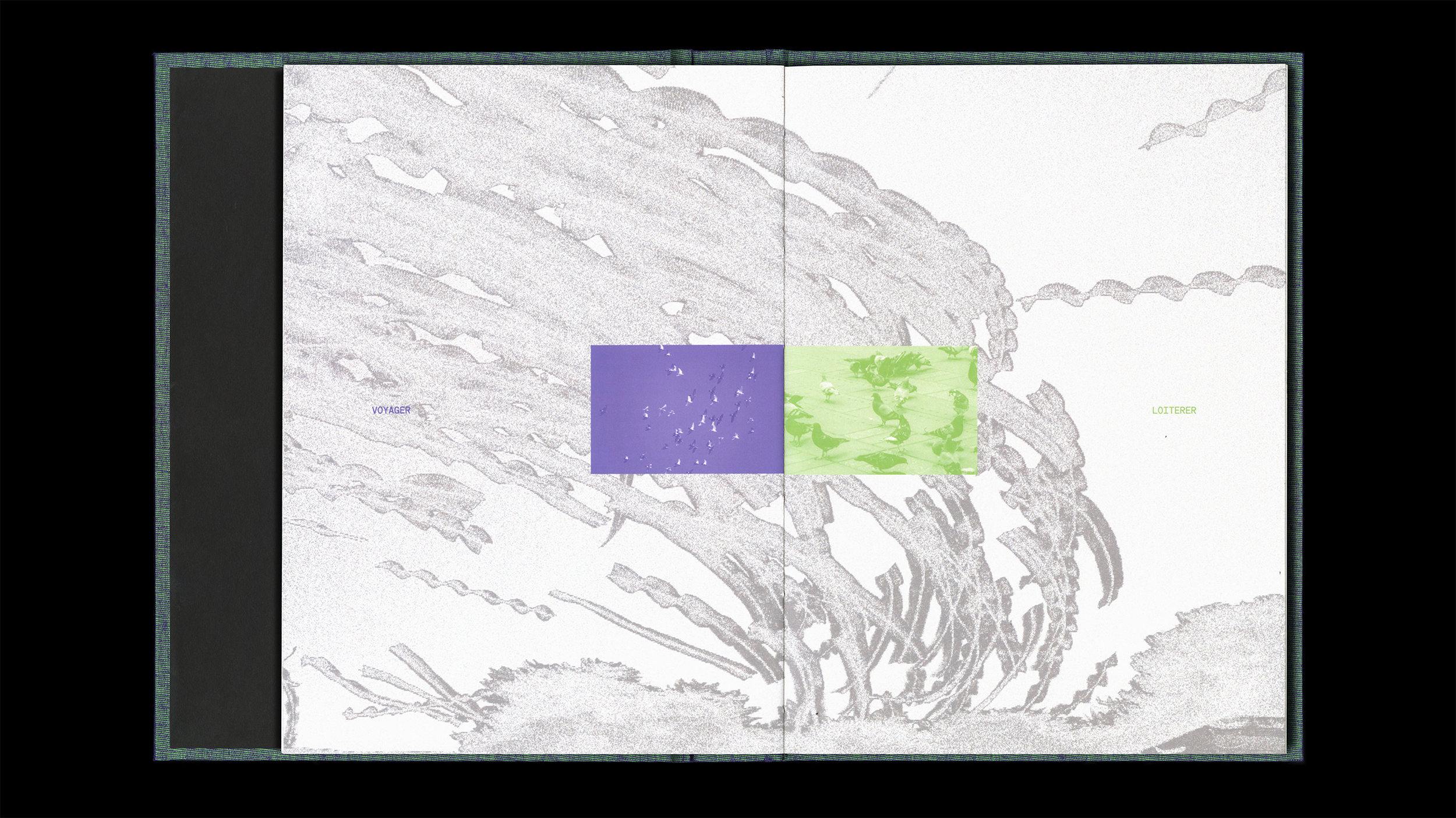
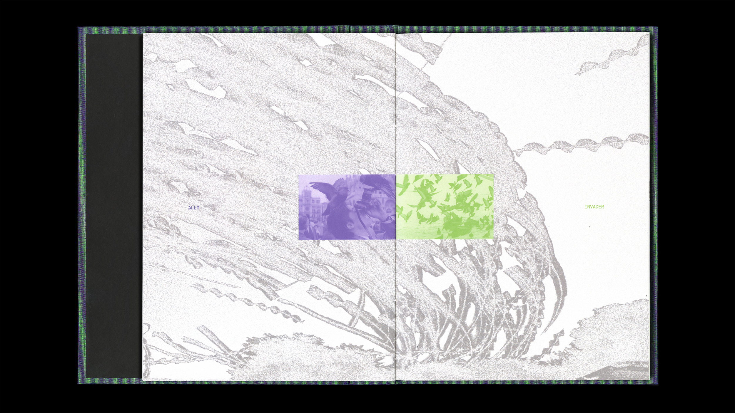
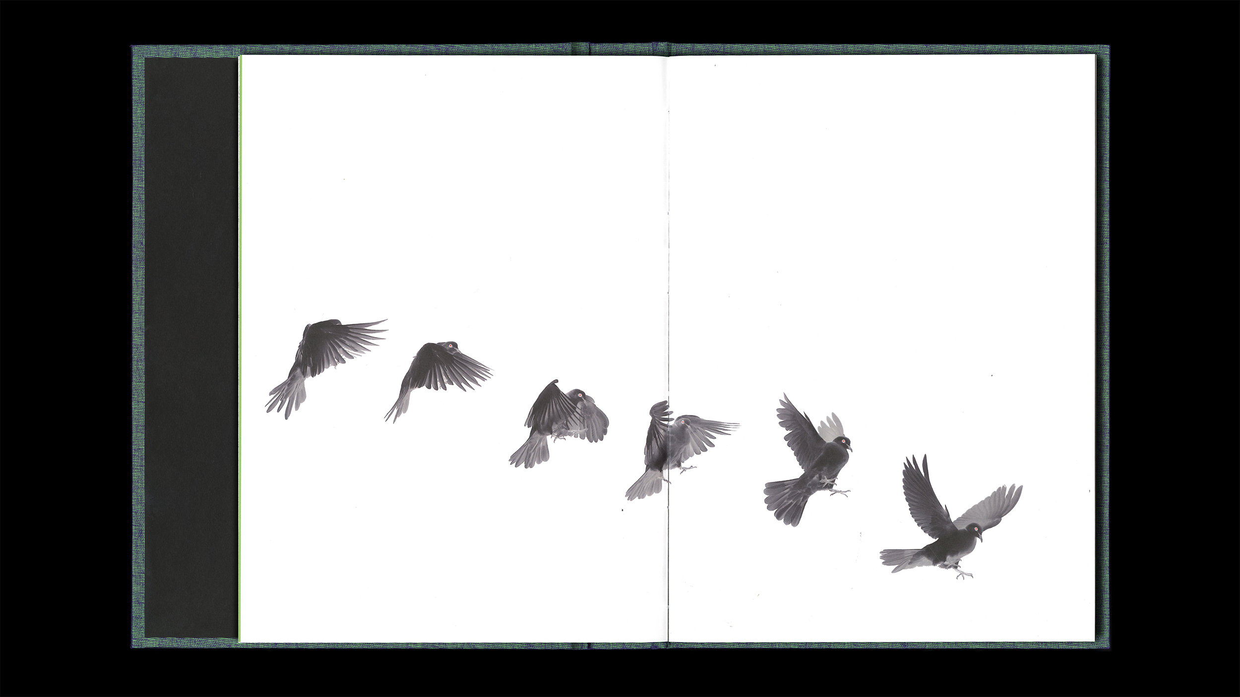
The prologue juxtaposes two contrasting images of pigeons, asking, “Are they allies or invaders?” It invites readers to explore the complex and often misunderstood world of pigeons.


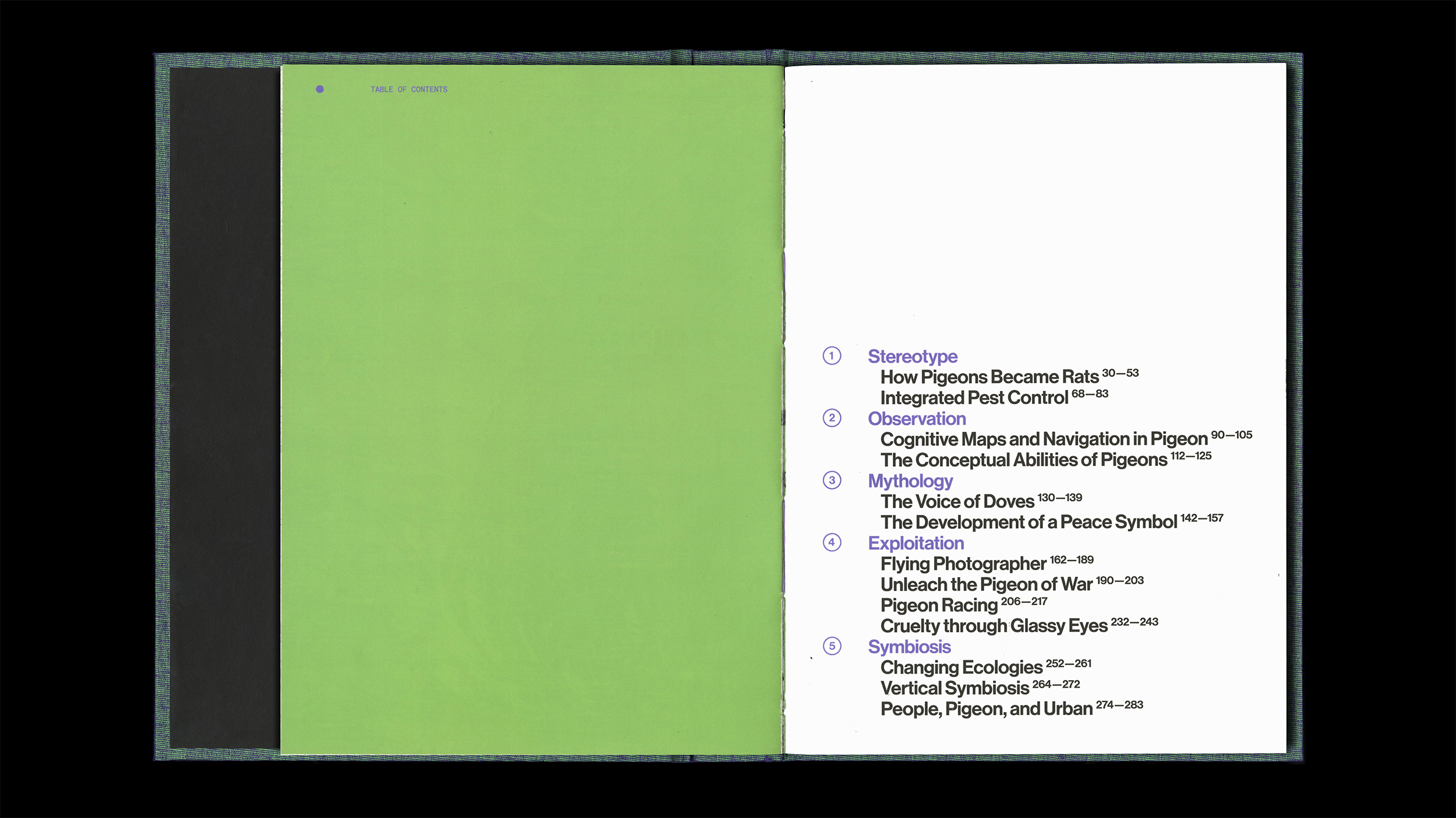
︎︎︎Table of Contents
This book is divided into five chapters—Stereotype, Observation, Mythology, Exploitation, and Symbiosis. Through its five chapters, it explores the intricate relationship between humans and pigeons. Each chapter delves into different aspects of how pigeons are perceived and interact with humans, ultimately encouraging a rethinking of pigeons for urban symbiosis.

︎︎︎Generative Typography
Using Processing, I created software that generates the visual language for each chapter by experimenting with various parameters such as shapes, sizes, spacing, and scattering. These elements, even when text readability is compromised, are applied throughout the book as graphic elements, contributing to the overall aesthetic and thematic coherence.
︎︎︎Selected Works
ARCANA Hospitality Branding
PIGEON PARADOX Publication Design
ASIAN CINEVISION Cultural Institution Branding
NANOTECH EXPO Identity System
FIBER IS MY ALPHABET Exhibition Catalog
MAGNIFIK Font Design
︎ hi@jennalee.design
© 2024 Jenna Lee